One of the things we talk about in UX is the quintessential use case: a description of the ways in which a user interacts with a system or product. Spoiler alert: there is always more than one use case, because there’s always more than one way to interact with a thing. When creating use cases, I think one of the most important things to remember is that one of the subjects in your scenario is a human — a messy, emotional, very real human being who is simply trying to do a thing. While you can work hard to make a thing easy to use (website, application, gas tank, garage door, take your pick), the better UX designers will think about doing a stress test use case. What do I mean by stress test? Any conditions that will push your user to make it more difficult to accomplish a task. An obvious one here is trying to make accommodations for disabilities; we try to stress proof websites by considering (and eliminating) visual, auditory, cognitive, physical, or contextual challenges for our users. But even with the best of intentions, some things are outside of our control because humans, as I have said before, are messy. Humans have emotions and needs, and when our emotions get the better of us, we go into lizard brain mode which, ironically, makes things even harder for a user to accomplish the intended task. Emotions can cloud our judgement, and it doesn’t have to be in a life threatening situation; it can simply be as basic as hindering our ability to make a decision.
Let me tell you a story.
Recently I’d been away for a couple weeks, and when I returned home, decided I would catch up on a few web projects over the weekend. I have a tendency to get really focused when I’m in project mode and as a result, I found myself breaking at 9pm with eating nothing other than breakfast 14 hours before. I was ravenous. As I’d only just gotten back, I hadn’t yet restocked my pantry or refrigerator, so my easy food options were few. Then I remembered I could run out to my local Sheetz and grab a sub — and, better still, I could order it from home on the app, and it would be ready for me by the time I drove the two miles to pick it up. Sweet!
 So I pulled out my phone, fired up my app, and decided I wanted a hot sub — specifically, a cheesesteak. My brain was very excited about a cheesesteak, but I quickly discovered just about anything could be put on a cheesesteak. I was so tired I was having difficulties focusing on what was standard. Lettuce, tomatoes, onion? Was the onion fresh, or sautéed? Speaking of sautéed, do mushrooms come on a cheesesteak? Even though it’s in the name, is there actual cheese on the cheesesteak? Well first, it depends on who you ask and where they’re from. But I was struggling just trying to separate the different types because I was really hungry, but this damn 20 questions game was making me angry. DID YOU KNOW Sheetz offers 4 kinds of bread, 6 types of cheese, 18 different spreads, and 19 different toppings for your cheesesteak? I was ten minutes into this process but no closer to getting food. (You can watch me scroll through the options by watching this screen capture from my phone.)
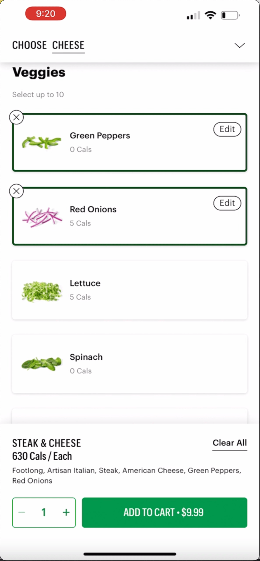 Lucky for me, I also used to work around the corner from a Subway shop, which meant I also had that app on my phone so I could order my sandwich and saunter over to pick it up right away. While I had no idea where the closest Subway shop is to me, I was hoping that app was clearer about what came on a cheesesteak. Not only was the information there, but the way it was presented was much cleaner, much clearer, did not make me think, and showed me the information I needed so I could get a sandwich ordered despite being dangerously hangry. For the record, Subway also offers a lot of options: four types of bread, four kinds of cheese, ten types of veggies, ten types of sauces, three types of seasoning, as well as some extras. (Like the previous example, you can see me walk through this process by watching this screen capture from my phone.) HOWEVER, the typical ingredients were already pre-selected.
What kind of magic is this??!!?
 In the blink of an eye I was instantly relieved and I could feel the stress begin to drain away. This is a classic example of the blank page scenario: an empty page is always more intimidating than a rough draft because with a rough draft, there’s already something to work with. On the Sheetz app, it was clear they would make my sandwich however I wanted them to make it, but I had to select every ingredient from scratch. My hungry lizard brain was overwhelmed by choices and I honestly shut down. On the Subway app, we eliminate the blank page by providing context in the form of a basic recipe. I don’t have to go with everything that is pre-selected. But it gives me a framework to work from and, in my state, my lizard brain started to recede and semi-rational Robin took over. I tweaked the toppings: I ditched the green peppers (eww), added more tomatoes, added salt, pepper, and Parmesan (I’m a rebel, what can I say?) and was through that order in 5 minutes and on my way to pick it up.
So what did we learn from this story (other than I should have already done my shopping)? Thinking about stressors a user might be experiencing while interacting with your system is a lot like thinking about usability and accessibility right from the start of a project: It allows for a broad spectrum of users to use your product. Some people will breeze right through but it also accommodates people who have a disability of some sort, are distracted, are juggling too many things, or are so hangry that part of their lizard brain just shuts down because you keep asking your user to make too many decisions for too much input. Are you trying to do “all the things” to make an experience easier and more complete but, in reality, are you just making things harder? Perhaps the lesson here is to put yourself in your user’s shoes and meet them halfway so their experience is smarter, not harder. That’s the sign of a good user experience — whether you’re hangry or not.
Let’s just call it food for thought.